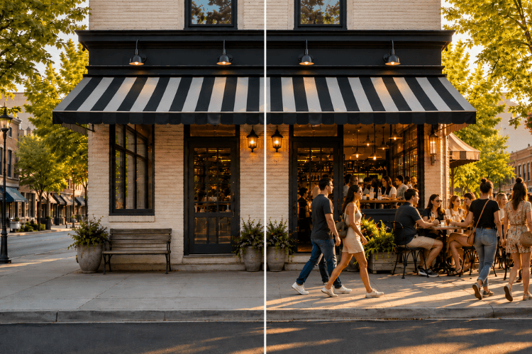
Take a look around you right now. If you are in a public place, you will probably see that most of the people are looking at their phones. This is a simple fact of modern life and it is also true for your business. Most of your potential new customers are now looking at your website on their phone and not on a big desktop computer. So, the big question you need to ask is: what happens if your website is hard to read or use on that small screen? This blog is a look at “responsive design” and why it is so important for your business.
Why is a Mobile-Friendly Website So Important?
Having a website that works well on a phone is important for two main reasons: your customers and Google. The first reason is the customer’s experience. If a potential customer lands on your website on their phone and they have to pinch and zoom just to read your text then they will get frustrated and leave. A bad mobile experience can lose you a new customer in just a few seconds, and they will probably not come back to your site again.
The second big reason is that Google now pays a lot of attention to mobile-friendly sites. Google knows that most people do their searching on their phones, so it now ranks websites that work well on mobile much higher in its search results. Not having a good mobile site can make your small business web design in Savannah almost invisible to new customers who are trying to find you. This is why a good SEO-friendly website design in Savannah GA is so important.
What is “Responsive Design”?
“Responsive Design” is the name for a way of building a website that can automatically change to fit any screen size.
It Adjusts to Any Screen
A responsive website is one that can “see” the size of the screen it is being looked at on. The layout of the page will then automatically change to fit that screen perfectly. This means that your site will look good and be easy to use whether a person is on a small phone, a medium-sized tablet, or a large desktop computer.
The Text is Easy to Read
On a responsive site, the text size will automatically get bigger when it is on a small screen. This is a very important feature. It means a visitor to your site will not have to zoom in with their fingers to be able to read your information or your phone number.
The Buttons are Easy to Tap
It is very important for a mobile site to be easy to use with your thumb. The buttons and the links on a responsive site will be made bigger. They will also be spaced farther apart on a phone which makes them very easy for a person to tap without hitting the wrong thing by accident.
The Images are Resized
Large high-quality images are great for a big computer screen but they can make a website very slow to load on a phone. A good responsive website design agency in Savannah will make sure that all of your images are automatically resided. They are made smaller on a phone so that your site still loads very quickly for your visitors.
How Do We Build a Mobile-Friendly Site?
We have a clear process for making sure your site works well on all devices.
We Use a “Mobile-First” Plan
Professional mobile-friendly website designers in Savannah usually design the phone version of the site first. This forces us to think about what is the most important information that your customers need to see. We then add more to the design for the bigger scenes later on.
We Keep the Design Simple
A plain and clean design always works much better on a small screen than a cluttered one. We avoid using a lot of extra boxes and links on the mobile version of a site. This helps to make sure that your most important information is very easy for a visitor to find.
We Test it on Real Phones
After the site has been built, we do not just guess that it works correctly. We take the time to test it on different kinds of real phones like iPhones and Android phones. This is how we make sure that it works the right way for everyone who might visit your site.
Wrapping Up
Having a website that works well on a phone is not a luxury for a business anymore, rather it is a necessity. A good mobile experience is an important part of keeping your potential customers happy. It is also a very big part of making sure that your business can be seen on Google.
Contact us at info@JDelSURMarketing.com if you need a website that works on any screen, you can talk to our savannah website design consultancy to know how it works.
Frequently Asked Questions
How Can I Check if My Current Website is Mobile-Friendly?
A simple way to check is to open your website on your own smartphone and try to use it. Is the text easy to read without zooming in? Are the buttons easy to tap with your thumb? If the answer is no, then your site is not very mobile-friendly.
What is the Difference Between a “Responsive” Site and a Separate “Mobile” Site?
A responsive site is one single website that automatically changes its layout to fit any screen size. A separate mobile site is a completely different, second version of your website that is made just for phones. Today, responsive design is the much better and more common choice.
Will My Old Website’s Content Work on a New Responsive Design?
Yes, it will. We can take all of the existing text and pictures from your old website and move them over to the new, responsive design. We can also help you to write new, simpler content that is a better fit for a mobile audience if you would like.